Obiettivo Cenni Storici
Immaginario di Riferimento Chiavi di
Lettura Codici
Cinematografici Schemi Preliminari Immaginario Soggettivo Adduzzioni Paradigma
Organizzativo Scenari Risultato
INTRODUZIONE
E’ per me
doveroso ringraziare gli autori delle
informazioni seguenti in quanto non solo interesanti ma necessarie alla
comprensione della natura dell’oggetto di questa tesi.
Le
origini del
Il
concetto di manifesto pubblicitario nasce con i volantini utilizzati per promuovere
gli spettacoli teatrali, il circo, l’ arrivo dei giostrai o di spettacoli del
selvaggio West. Jules Chéret (1836-1932), grazie all’ uso del processo
litografico introdotto nel 1798 dall’ austriaco Lois Senefelder, promosse la
produzione dei poster cinematografici che fino ad allora avevano costi elevati
dovuti al laborioso processo di incisione del legno o del rame.
Negli
Stati Uniti il Manifesto o POSTER fu
introdotto gia’ dal 1819 grazie al lavoro di Bass Otis mentre in Europa fino
dal 1896, il collezionismo di poster cinematogarfici raccoglieva I primi
adepti, specialmente quando erano realizzati da personaggi quali Toulouse-Lautrec (che con Moulin Rouge nel
1891 fece guadagnare al poster il titolo di forma d’arte), Alphonse Mucha (che con il lavoro per Sarah
Bernhardt creo’ uno dei primi pezzi di ART NOUVEAU), Dudley Hardy e Frederick
Walker che con The Woman in White (1871), dimostro’ la potenzialita del mezzo
grazie ai risultati di botteghino. Cheret fu anche responsabile per il passaggio
litografico a tre fasi utilizzando tre pietre con tre diversi colori che
permetteva uno spettro di espressione migliore. Da Parigi nel 1870, divenne la
piu’ potente forma di comunicazione di massa. Le strade d’ Europa divennero
gallerie d’arte ed il manifesto apri’ la strada all’eta’ moderna della
pubblicita’.
Negli
anni 80 del 1800 si potevano osservare diverse correnti tra Francia, Germania,
Olanda e Spagna: ogni Nazione aveva uno stile ed un oggetto, dai Caffe’ alle
Corride. I poster Olandesi erano caratterizzati dall’ordine delle linee pure,
quelli Italiani dalla loro drammatica grandiosita’, quelli tedeschi dai
caratteri medievali.
L’
Art Nouveau perse parte del suo dinamismo con la morte di Mucha e Cheret I
quali gia’ avevano abbandonato I manifesti ed intrapreso la pittura. Leonetto
Cappiello, un Italiano che arrivo’ a Parigi nel 1898 riempi’ il vuoto che si
era creato.
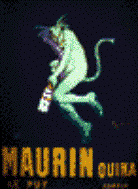
Cappiello
rifiutava il dettaglio “arzigogolato” dell’ Art Nouveau e preferiva l’ immagine
semplice, divertente e magari bizzarra che catturasse subito l’attenzione
dell’osservatore. Nel 1906 con Maurin Quina, un manifesto pubblicitario per una
marca di Assenzio, Cappiello creava il concetto di identita’ della marca.
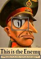
La
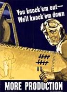
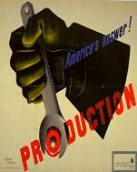
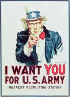
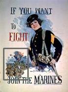
Prima Guerra Mondiale testimonio’ un nuovo ruolo per il poster: quello della
Propaganda. Ne parti’ un campagna pubblicitaria tuttora mai superata: essa
riguardava settori che andavano dalla raccolta di fondi al reclutamento di
soldati e volontari, dall’ incentivazione della produzione alla spinta all’odio
per il nemico. Solo in USA furono prodotti 2,500 poster per 20 millioni di
pezzi - 1 per ogni 4 americani nel giro di due anni.
Nel
primo dopoguerra vennero alla luce nuove realta’ legate alle correnti d’arte
dell’epoca come il Cubismo, il Dadaismo, il Futurismo, e l’ Espressionismo che
lasciarono forti segni ed influenze sul Graphic Design.
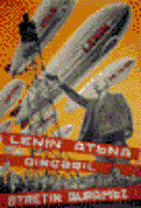
In Unione Sovietica il movimento
Costruttivista si affermo’ con l’obiettivo di creare una nuova societa’
tecnologica. Fondato sul movimento Suprematista di Kasimir Malevich, esso
sviluppo uno stile compositivo “agitazionale” segnato da forti diagonalita’,
fotomontaggi e colori intensi. Guidato da El Lissitsky, Alexander Rodchenko,
Gustav Klutsis, e i fratteli Stenberg,
il Costruttivismo ebbe un forte impatto sul Design occidentale soprattutto
attraverso la Bauhaus ed il de Stijl.
Il linguaggio scientifico del
Design fu reso popolare in un nuovo movimento decorativo internazionale
chiamato
In questo stile da era delle
macchine, potenza e velocita’ divvennero I temi principali. Le forme vennero
semplificate e rese piu’ affusolate, caratteri curvi vennero rimpiazzati da
altri piu’ spigolosi. L’Art Deco mostro’ una grande varieta’ di influenze
grafiche, dal movimento cubista, futurista e dadaismo; dai progressi della
secessione Viennese al Plakatstil fino
all’ arte esotica persiana , egiziana e Africana.
Il termine Art Deco’ sorge con
l’esposizione del 1925 a Parigi
Le caricature di Cappiello fecero
strada alle immagini geometriche di A.M. Cassandre, il quale rese popolari le tecniche
dell’aerografo che diedero un’aspetto meccanico alle sue immagini. I suoi
maestosi poster come per il Normandie, il Statendam e Atlantique, divvennero
icone del’era industriale. L’Art Deco’, come l’Art Nouvau prima di essa, si infiltro’ su tutta l’Europa.
Degni di nota, Federico Seneca e
Giuseppe Riccobaldi in Italia , Ludwig Hohlwein in Germania, Pieter Hofman in
Olanda, Otto Morach and Herbert Matter in Svizzera, E. McKnight Kauffer in
Inghilterra , and Francisco Gali in Spagna.
Il poster ancora una volta gioco’
un grande ruolo comunicativo nella Seconda Guerra Mondiale, ma questa volta
condivise l’attenzione avuta anche da altri media: La Stampa e La Radio. In
questo periodo i poster erano stampati usando l’offset per via dei grossi
numeri di pezzi richiesti. Questo metodo di stampa risulto’ nell’aspetto della
tipica puntinatura dell’immagine.
L’uso della fotografia nei poster
inizio’ in URSS negli anni 20, e divento’ comune come forma di illustrazione.
La svizzera fu l’ultimo bastione
dell’ immagine litografica classica. Il governo Svizzero ne promosse la tecnica
e sprono’ l’eccellenza per anni.
Il “Sachplakat” Svizzero si
sviluppo’ nei primi anni 50 a Basilea trasformando oggetti quotidiani in
gigantesce icone. Con il sorgere di un era post-bellica dell’informazione, la
predominanza Svizzera nel campo dei poster continuo’ a crescere nello sviluppo
di un nuovo stile grafico che si radica nella Bauhaus:
lo Stile Tipografico
Internazionale. Esso si basa su regole matematiche e logiche severe e divenne lo stile predominante nel mondo
negli anni 70.
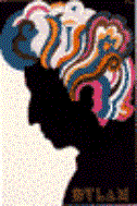
L’ “Immagine Concettuale”, un
nuovo tipo di stile di illustrazione, prende spunto liberamente dal
Surrealismo, Pop Art, ed Espressionismo. Un esempio famoso e’ quello della
copertina di un album di Bob Dylan
realizzata da Milton Glaser nel 1967.
Il suo Push Pin Studio fu
eguagliato in creativita’ solo dalla dinamica scuola Polacca negli anni dall’
1950 al 1980
La scuola Polacca divenne
conosciuta per lo stile sarcastisco e le immagini forti che pruomovono le
organizzazioni culturali e d il teatro controllati dallo Stato
Altri maestri del Conceptual Image
includono Armando Testa, Gunter Rambow
e Nicolas Troxler.
|
|
|
|
|
|
|
|
|
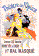
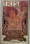
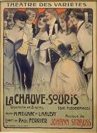
Jules
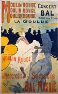
Cheret |
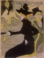
Henri de Toulouse-Lautrec |
W.
Pothast |
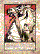
William H. Bradley |
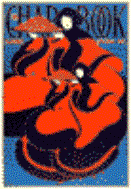
Leonetto
Cappiello |
Leonetto
Cappiello |
Sidney H. Reisenberg |
|
|
|
|
|
|
|
|
|
|
|
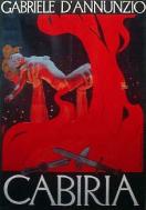
Anonymous |
Miziakin, P. |
Cassandre |
Cassandre |
Pieter
Hofman |
NiklausStoecklin |
Armin
Hofmann |
Milton
Glaser |
Wolfgang
Weingart |


|
|
|
|
|
|
|
|
|
|
|
|
|
|
HISTORY OF THE MOVIE POSTER
The First Movie Posters
The turn of the century saw a world with a very high illiteracy rate therefore
posters, provided a means of advertising on a level that could be understood by
the general public. Posters could be placed almost anywhere in the city and
were widely used to promote a variety of products and services, including early
cinema.
Jules Cheret, the father of the modern poster, is credited with bringing
the movie poster into existence. Cheret produced a lithograph for the 1890
short film program called Projections Artistiques showing a young lady holding
a placard with the times of the shows. Cheret followed with his poster for
Emile Reynaud's Theatre Optique 1892 program called Pantomines Lumineuses.
In 1896, M. Auzolle designed the first poster for a specific film,
actually containing scenes from the program, which depicted a young boy’s prank
with a gardener’s hose, for Lumiere's film entitled L'Arroseu Arrose. This film
is also generally considered the first fiction movie ever made.
Movies and Movie Posters of the 1900's
By 1900, motion pictures were hugely popular attractions at amusement
parks, music halls, traveling fairs and vaudeville theatres in
In 1903, Edwin S. Porter, produced The Great Train Robbery, a tremendous
hit, whose success led to the establishment of "nickelodeons," the
forerunner to movie theatres. Initially begun in 1905 by an ingenious
By 1909, the number of companies producing movies was growing rapidly.
Thomas Edison joined forces with the larger studios in an attempt to shut out
smaller rivals. The major studios at the time, Biograph, Essanay, Kalem, KIeme,
Lubin, Selig and Vitagraph, joined Edison to form the Motion Picture Patents
Company. This group of studios also organized the General Film Company to
distribute the studios' films to theatres.
One of the first steps made by this newly-formed cartel was to set
standards for advertising materials. The General Film Company contracted with
A.B. See Lithograph Company of Cleveland to produce all the members' posters
and ad materials.
Edison set the standard size for a movie poster to be 27"x
41". This poster became known as the " one sheet." The one sheet
was designed to be used in glass display cases inside and outside of movie
theatres. The first such one sheets depicted the company identity and the
film's title and plot. Each of the member companies had its own stock poster
borders printed in either two or three colors. There was a white panel left in
the center which would have the title and description of the movie's plot. In
some cases, even the ending was printed. The posters sometimes included a
photograph supplied by the movie's producing company. Strict censorship
standards were established by the General Film Company, and all member
companies were required to meet these rigid standards.
Since the A.B. See posters were subject to the scrutiny of the Patents
Company, independent lithographers began printing generic posters showing
scenes varying from romantic embraces to shoot-outs. These posters were popular
with many theatre owners because they were considerably cheaper, could be used
over and over, and were more graphic and uncensored than the materials
sanctioned by Edison's Patents Company.
Movies and Movie Posters of the 1910's
Up to this point in film history, there were no "movie stars."
Most of the actors in the early films choose to remain anonymous fearful of the
impact of this new medium on their established stage careers, whilst benefiting
Producers who could keep a tighter reign on the Production. However, as early
as 1908 Studios began receiving mail addressed to nameless actors. Producers
soon recognized that the real selling tools were not the movies but the
"stars" that graced their screens. Posters now had to reflect the
size and status of the 'leading lady" and "leading man." Soon
the public could recognize one's "star status" simply by looking at a
movie poster with the font size and the placement easy indicators as to just
how "big" a particular star was. Movie contracts would now include
clauses relating to the size and placement of names on the movie poster and
other advertising materials.
By the early 1910's, nickelodeons were being replaced by movie theatres
with more room to advertise their new films, which now had two reels. To
complement the one sheet, new advertising sizes and types were introduced by
the
Lobby cards were smaller in size and were normally printed in sets of
eight. The first of these cards were actually 8" x 10" black and
white stills, which were printed in sepia or duotone and tinted by hand. They
were later replaced with 11" x 14" color lobby card sets. These sets
normally contained eight scenes from the movie which were normally displayed in
series in the theatre lobby.
Two larger sized paper were also introduced at this time. One, Known as
the "three sheet," at exactly three times the size of the One sheet
it measured 41" x 81" and the larger six-sheet, being six times the
size of a one sheet and measuring 81" x 81". This decade however,
also also saw
With more films on the market, competition heated up and movie studios
widened their advertising boundaries to include areas outside of the movie
theatre. With new roadways being built movie companies recognized that the
highway's "open spaces" offered another advertising medium - the
billboard. The "24 sheet" as it was known, measured 246" x
108," exactly 24 times the size of the one sheet.
Movies and Movie Posters of the 1920's
By the early 1920's grand movie palaces soon replaced the movie theatre,
and well known commercial artists were commissioned by many studios to design
movie poster "portraits" of leading stars. Posters no longer depicted
scenes but were designed with portraits of the stars, the movie title and the
stars' names. By the 1920's, a new printing process was also developed. Known
as photogelatin or heliotype, this new process was used primarily on smaller
sized card stock items, such as lobby cards, inserts and window cards. Evolving
from one color to three (yellow, pink and blue), this process was used for
materials meant to be viewed closely. These items were not as effective when
viewed from a distance. One-sheets and larger paper continued to be printed via
stone (and later aluminum plate) lithography.
In 1926 the radio made its appearance and it had a direct impact on the
movie industry. In the mid-1920's, Bell Telephone Laboratories developed a
system known as Vitaphone, that could coordinate the sound with the action
being projected. Warners release of “The Jazz Singer” in 1927 heralded the
popularity of the new "talkies", which was so great that movie
attendance in the United States increased from 60 million people in 1927 to 110
million two years later. With attendance figures skyrocketing, the public demanded
more movies. More movies meant more advertising dollars and more movie posters.
The appearance of movie posters would soon change dramatically, due to a
new color offset printing process developed by Morgan Litho Company This
process made it possible to photograph the artwork provided by studios through
screens separated by color. While not as colorful as the stone lithography
posters, the color offset process produced sharper images. Over the next twenty
years, the two processes would continue to be used. However, by the 1940's,
color offset would replace stone lithography for all poster printing.
Movies and Movie Posters of the 1930's
Movie posters began to take on the "art deco" look. The use of
dense backgrounds was eliminated, and more white space was created. Varying
sizes and styles of letter were used, and the placement of the letters became
more creative.
The movie studios during this period generally produced two styles of
the one-sheet and half-sheets, each with different artwork. They were known as Style
"A" and "B" (used by Paramount Studios); Style
"C" or "D" (used by MGM); or, in some cases, "X"
and "Y" (used by Universal in the 1930's).
The main negative affect experienced in the industry as a result of the
Great Depression was that movie goers now sought out cheaper priced tickets.
With the cheaper admission tickets, the movie studios chose to cut back on
operating costs - one of these being the advertising materials. As a result,
movie materials were more cheaply produced, and thus lost some of the
lavishness of their predecessors.
By 1939, National Screen Service, entered into contracts with the major
studios and many of the independents to handle production and distribution of
their movie paper. In order to control the number of materials going through
it, NSS instituted a date and number coding system for all the movie
advertising paper they handled. The numbering code included the year of
distribution and the sequential order of the movie's release.
Movies and Movie Posters of the 1940's
The early 40’s brought World War II. The movie studios and many of their
stars did their part in creating a climate of patriotism, and war movies were
genre of the day. The movie industry was forced to make cost-cutting
adjustments - primarily in their advertising budgets. With a worldwide shortage
of paper, many studios used the lesser grade of paper utilized by the
newspapers. Some were also printed on the reverse side of old war maps.
Movies and Movie Posters of the 1950's
By the 50’s with the War behind them the movie studios changed their
movie subject matter from the war to science fiction, comedy, and "B"
grade drive-in movies. The "fan magazines" also made its appearance
during this time period and their magazines were replete with color photographs
of all major movie stars. Movie companies adopted this style of advertising,
and soon movie posters began to look more like color photographs, using tinted
photographs and large stock lettering and with the number of cars on the roads,
posters were designed to be seen from long distances. Stone lithograph movie
posters were now a thing of the past.
Movies and Movie Posters of the 1960's
The relaxation of censorship and the change in social customs made way
for the movie public’s introduction to nudity, profanity and excessive violence
while desegregation and the Vietnam War created an atmosphere of social
consciousness, which movie makers addressed through their films. Movie posters
during this time mirrored the shifting social climate and began to reflect the
changing attitudes toward violence and sex while the use of photographs was
replacing the painted artwork common in the early years.
Movies and Movie Posters of the 1970's
The movies posters of the 1970's continued the use of photography.
Drawing and painting styles were still being used occasionally, and artists
like Amsel, Frazetta and Peak lent their names to some of the more popular film
posters of this era. Movie posters were now being printed on a clay-coated
paper which gave them a glossy finish smooth to the touch.
Movies and Movie Posters of the 1980's
The 1980's witnessed great advances in the development and use of
special effects and their becoming key to the success of the major Box office
hits. Also by the 1980's, the National Screen Service had lost its control over
the movie paper industry. This, along with the advent of the multi-screen
complexes, saw the lineup of advertising materials available to theatres change
drastically, with numbers of films shown simultaneously in Multiplexes competing
for an audience and space for their in theatre promotion becoming more and more
limited, calling for a smaller number of high impact posters.
un piccolo
commento
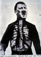
Come e’ stato qui appena espsto, il
Manifesto Cinematografico ha avuto e continua ad avere molteplici funzioni.
Dalla propaganda promossa da nazismo e fascismo ai movimenti di protesta contro
di essi. Manifesti che hanno raccontato
la rivoluzione russa, la guerra civile spagnola, la nascita della Repubblica
italiana, l’occupazione americana del Vietnam, il colpo di stato in Cile… le
lotte sindacali e antirazziali, il diritto di voto alle donne, fino al divorzio
o all’aborto, passando attraverso i movimenti di sensibilizzazione sui grandi
temi dell’ecologia, l’energia nucleare, la fame nel mondo, i diritti umani... e
inoltre i manifesti sullo sport ed il turismo.
Temi e soggetti che, attraverso l’arte, costruiscono
idealmente un vero e proprio viaggio nella storia del Novecento, facendo
emergere non solo i grandi drammi, le ideologie, gli eventi, ma anche le
speranze, la storia del costume, attraverso i cambiamenti della moda e dello
stile di vita. il manifesto appare nella forza dirompente che gli deriva dalla
sua doppia natura, storica e artistica, ed è l'uso del linguaggio delle avanguardie
contemporanee, l' intuizione del "nuovo" già in atto (e di quello che
deve ancora venire) a conquistare lo spettatore e tutti noi.
Il POSTER non deve solo pubblicizzare, promuovere, accellerare la fruizione di un prodotto o di un Idea.
Nel caso
particolare dl Cinema, Il poster cinematografico ritrae la promessa di un
esperienza.
La nascita del poster cinematografico ha due origini: viene
richiesto o dal distributore (Columbia, Buena Vista, Paramount etc..) o dall’
agente che lo utilizza per raccogliere fondi o per promuoverlo ai festival di
Cinema. Da notare inoltre, e’ il fatto che la grande casa di distribuzione
decide se promuovere una campagna a livello mondiale o se interpellare
designers per ogni situazione di tradizioni, cultura e target che cambia di
paese in paese. Ad esempio, il poster per Hercules venne realizzato in due modi diversi per gli USA e per il
Regno Unito. Nei primi si punto’ sulle nuvolette e la giocosita’ nel secondo
invece si sfrutto l’immagine del dio dell’ aldila’ in quanto piu’ attraente e
“cool” per i maschietti di 8 anni britannici . Una caratteristica importante
per il poster e’ quella che deve essere diretto anche nel distinguersi come
prodotto: a volte esistono immagini straordinarie che pero’ fanno capire a fatica
che si tratti di un film piuttosto che una mostra d’arte fotografica. Un
secondo aspetto ovviamente e’ l’individuazione del target nei termini di fascia
d’eta’, sesso, (per famiglie, coppiette, amiche, amici, etc) posizione
professionale, livello di cultura e in futuro, (come gia’ da oggi in paesi come
Francia e Gran Bretagna) appartenenza etnica, religiosa. (basti pensare alla
Campagna di Monsoon Wedding..)